
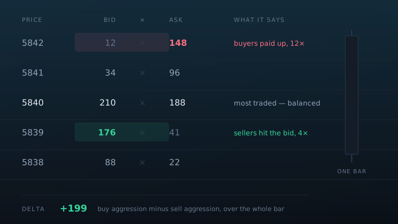
A candlestick compresses everything that happened in a bar into four numbers: open, high, low, close. It tells you where price finished. It says nothing about what it cost to get there — how many contracts changed hands at each price, or which side was doing the crossing.
A footprint chart — the same thing is also sold as a cluster chart, a numbers bar, or an order flow bar — puts that information back. Each bar becomes a column of prices, and at every price you see the volume that traded there, split by who was aggressive.
What the numbers actually are
Every trade in a futures market has a buyer and a seller. What distinguishes them is who crossed the spread. If a trade prints at the offer, a buyer paid up to get filled — that volume is counted as ask volume. If it prints at the bid, a seller hit the bid — bid volume.
A footprint cell therefore reads something like 142 × 96: at this price, 142 contracts traded
into the bid and 96 into the offer. Both sides always net to the same total; what changes is who was impatient.
Delta
Subtract one from the other and you get delta — a running measure of aggression. Positive delta means market buyers were leaning on the offer. It does not mean price will rise; it means buyers were paying up. Whether that produced anything is the interesting part.
Strong positive delta with price failing to make a new high is the same statement Wyckoff was making a century ago: effort without result. Buyers were aggressive, and somebody sold into all of it.
Imbalance
Comparing a cell against the one diagonally below it — bid at one price against ask at the price above — gives an imbalance. When one side is several times the other, that price level saw genuinely one-sided trade. Stacked imbalances often mark levels that price respects on the way back.
Absorption
The pattern most worth learning. Heavy volume repeatedly hitting a price with price refusing to move through it means resting limit orders are absorbing everything thrown at them. On a candlestick chart this is a small wick. On a footprint it is unmistakable, and it usually marks somebody large defending a level.
Cluster chart or footprint chart?
Mostly the same thing under different names. The distinction people usually intend:
- Footprint — bid and ask volume shown separately, side by side, at each price.
- Cluster — total volume per price cell, often heat-coloured, without splitting the sides.
The split matters. Total volume at a price tells you activity happened there; the bid-versus-ask split tells you who initiated it. If a tool only shows you totals, you cannot see absorption, and absorption is the reason to use one of these charts at all.
The data you need first
This is the part that catches people out, and it is not negotiable.
- Real exchange volume. A footprint built on tick counts rather than contracts is a picture of one broker's activity, not the market's.
- Tick-by-tick data, not aggregated bars. The chart is reconstructing each trade; minute bars have already thrown away everything it needs.
- Level II depth, if you want to see resting size as well as executed trades.
On NinjaTrader 8 this means a futures feed that carries tick and Level II data. It is why footprint charts are standard practice in futures and rare in spot forex — the data simply is not the same thing.
How to read one without drowning
A footprint bar contains far more numbers than a candle, and the usual failure is trying to read all of them. Three habits help.
Look at the extremes first. What happened at the high and the low of the bar matters more than the middle. A high with almost no ask volume was not tested; a high with heavy ask volume and no follow through was rejected.
Compare against location. A footprint pattern at the edge of the day's value area means something different from the same pattern in the middle of it. Keep a volume profile on the chart.
Filter aggressively. Most cells are noise. Set a threshold and let the tool highlight only imbalances and unusually large prints — the point is to see the few places that mattered, not to read every number.
Where it fits
Footprint charts answer a specific question well: at this price, who was aggressive, and did it achieve anything? They are poor at telling you what to trade and excellent at telling you whether a level is being defended.
They pair naturally with the older reading covered in volume spread analysis — VSA supplies the question, the footprint supplies the resolution to answer it.
The ICF footprint chart for NinjaTrader 8 implements these readings directly, with imbalance detection and volume filtering aimed at one thing: keeping the chart legible while you trade it.